28 Scatterplots, Correlation, and Regression
Learning Objectives
- Read scatterplots.
- Find a predicted value.
Scatterplots
A scatterplots shows the relationship between two variables typically notated x and y. The x variable is usually called the explanatory (or input) variable and is usually drawn on the horizontal axis of a graph. The y variable is typically called the response (or output) variable and is usually drawn on the vertical axis of a graph. Note that the names (x and y) and the locations (horizontal or vertical) of these variables are mathematical convention. Sometimes students drawn then on opposite sides of a graph and that is still ok mathematics.
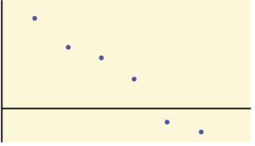
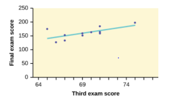
Examples. Identify the explanatory and response variable from the given scatterplot.
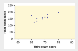
Solution:
explanatory variable is the third exam score
response variable is the final exam score
Image source: https://openstax.org/books/introductory-statistics/pages/12-3-the-regression-equation
Linear Correlation
Correlation and Correlation Coefficient
A correlation exists between two variables when the two variables have a relationship. In other words, the values of one variable are somehow related with the values of the other variable in some way. The linear correlation coefficient (denoted using a lowercase r), measures the strength of the linear correlation between the variables and is a value between -1 and 1 in other words. We will learn more below about interpreting this r value.
*Caution: Correlation doesn’t mean linear correlation. A data set can have correlation but not linear correlation.
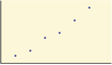
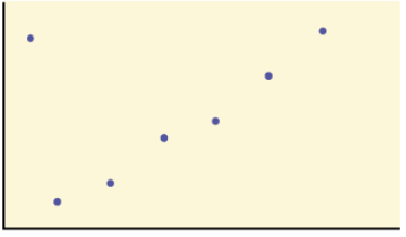
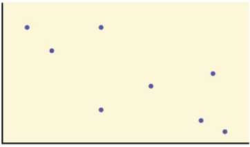
Examples. Determining linear correlation
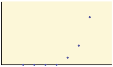
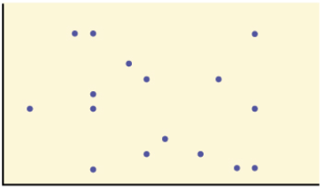
Question: Would the linear correlation coefficient indicating a linear relationship for any of these data sets? Explain.
Solution: Yes, because the data set has a linear pattern.
Solution: Yes, because the data set has a linear pattern. Even though there is one data value not fitting this "linear pattern" most of them are.

Solution: Yes, because the data set has a linear pattern. Correlation could be positive sloped line or negative sloped line!
Solution: Yes, because the data set has a linear pattern. The points don't fit a perfect line but we see the do tend to have a linear pattern still.

Solution: No, because the data set does not have a linear pattern. Even though there seems to be some relationship (possibly exponential) there is no linear relationship here.

Solution: No, because the data set does not have a linear pattern.
Source: https://openstax.org/books/introductory-statistics/pages/12-3-the-regression-equation
Interpreting the Correlation Coefficient
When the r value is close to 0, then we have no linear correlation.
A positive value of r means that when x increases, y tends to increase and when x decreases, y tends to decrease. This means that the points seem to form a line with a positive slope.
A negative value of r means that when x increases, y tends to decrease and when x decreases, y tends to increase. This means that the points seem to form a line with a negatve slope.
Examples
Example: Match the r value with the correct scatterplot. Then state whether the scatterplot has no linear correlation, positive correlation, or negative correlation.
r values: 0.237, -0.968, 0.988, 0.655, 0.002, and -0.324

r = 0.988, positive correlation

r = 0.655 , positive correlation
r = -0.968, negative correlation

r = -0.324, negative correlation
r = 0.237 , no correlation
r = 0.002, no correlation
Source: https://openstax.org/books/introductory-statistics/pages/12-3-the-regression-equation
Notice how for graphs with r values closer to 1 or -1, the points form a more clear line, while graphs with r closer to zero have a less clear line- or no possible linear pattern appearing.
Regression Line
We can model data with a line when the shape of the scatter plot appears linear, and the r is strong enough. The goal of the line of best fit or regression line is to have a line as close as possible to all points. The regression line minimizes the vertical distances between the data values and the regression line.The regression line is often denoted [latex]\hat(y) = a + bx[/latex] where a is the y-intercept and b is the slope.
Examples. Regression Line Equation
Identify the line that best matches the line.
![]()
![]()
![]()
Solution: (b) is the correct answer. We see that the line in the graph has a positive slope (this rules out (a)) and is not a horizontal line (this rules out (c). Furthermore, the equation in (b) has a slope and y-intercept that looks like it could match the line in the graph.
Source: https://openstax.org/books/introductory-statistics/pages/12-3-the-regression-equation
Prediction
We use the linear regression line to predict possible output values for input values that we do not have data on (i.e., for value not represented by dots on our graph). The following are steps for making predictions using regression lines. To do this, we find the regression line and input x-values for which we want the predicted y-values.
Attributions
- Content and images adapted from "MATH 1420: Geometry Concepts for Teachers" by the RSCC Math 1410/1420 OER Team under Creative Commons Attributions 4.0 International License.
