1 Characteristics of Growth Models
“Change is the only constant in life”
You may have heard this famous quote from ancient Greek philosopher, Heraclitus. Since this is a math class, we would like to develop a way to describe changes using numbers. In situations where there is a predictable pattern for how things are changing, we can develop a math formula to describe the change. We call these formulas growth models.
Let’s consider the following situations:
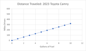
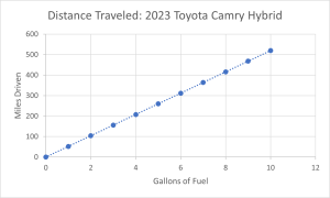
Example 1
These are examples of LINEAR growth models. A linear growth model changes by a set number amount. In this case, the rate of change is the car’s reported “miles per gallon” number. Depending on which car you are driving, for every 1 gallon of fuel you put in your car, you would expect to be able to travel the same number of additional miles (32 miles for the standard version or 52 miles for the hybrid). If you graph a linear model, it looks like a straight line.
Example 2
These are examples EXPONENTIAL growth models. An exponential growth model changes by a set percentage amount. In this case, the rate of change is the reported percentage increase. If you graph an exponential model, the graph is a curve that always increases — increases start slow, then get bigger and bigger over time.
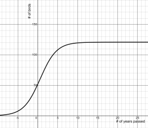
Example 3
This is an example of a LOGISTIC growth model. A logistic growth model starts with what looks like exponential growth (or constant percentage change), but ends up being slowed/limited due to external factors. If you graph a logistic model, the graph gives you an extended “S” shape, that levels out over time.
The “GROWTH” in the term growth models is actually a little bit of a deceiving. In all the situations above, values were increasing over time. However, we still use the term “growth model” even when values are decreasing over time. As long as a situations shows a predictable pattern of decreasing change, we still call them growth models . I like to think of these next examples as models of NEGATIVE growth.
Example 4
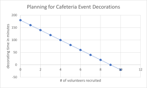
Each time the number of volunteers increases by 1, the total decorating time reduces by 20 minutes. Because our growth model is changing by a set amount (-20 minutes), this is considered a LINEAR GROWTH model.
Notice when looking at the graph, our points (linking the number of volunteers to the total project time) all connect to make a straight line — no curves or unexpected values. This is characteristic of all linear growth models.
Example 5
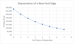
A new Ford Edge retails at about $38,000 when new. Each year, the value of the car decreases by 20% of the previous year’s value. This creates a predictable pattern! Because our growth model is changing by a constant percentage (-20%), this is considered an EXPONENTIAL GROWTH model.
For the Ford Edge, the biggest value decrease happens during the first year. Then, because we are taking the same percentage of a smaller number, the car does not lose as much value the next year. Notice how by year 5 (the amount of time it takes to pay off a typical car loan), the Edge is only worth about $12,500. Plotting the values, we create a nicely curved decreasing graph that is slowly approaching $0 as the years go by.
In the next section, we will look at how we can create mathematical formulas to represent these growth models. We can then use our formulas to make predictions and plans for how things may change in the future.
Reflection Assignment: A Visual Look at Social Issues
Choose a social justice topic you are interested in (I’ve listed some commonly-used options below):
- Voting Rights
- Climate Justice
- Healthcare
- Refugee Crisis
- Racial Injustice
- Income Gap
- Gun Violence
- Hunger and Food Insecurity
- Equality
Go the internet and find 2 different line graphs related to your topic of interest. These should each show some sort of change over time.
- Include the graphs (Copy/paste in your document or include the link. If writing the reflection by hand, draw a quick sketch of what the graph looks like)
- For EACH graph, write a paragraph (so I am looking for a total of2 paragraphs in this section). In your writing, I am specifically looking for answers to the following questions:
- What is the subject/purpose of the graph? What is it about?
- What does the graph show? Be specific about the data. What trends do you see? Are there specific interesting points?
- What type of growth model best describes the graph (linear, exponential, or logistic)? If none, explain why.
- How clear is the graph? Be sure to consider labels, colors, etc. What do you like/dislike about the visual presentation? How could it be improved?
- In a final paragraph, consider both of your graphs together. Be sure to answer the following questions:
- What is the problem that these graphs come together to address?
- How does looking at the graphs together increase your understanding about the topic?
- Who created or published the graphs? Did they have an agenda/purpose in sharing the data?
- Did you find the information presented useful or surprising? Why or why not?
- What additional questions did the graphs make you want to consider?
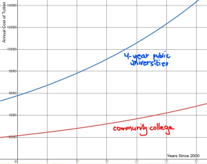
- Hanson, Melanie. “Average Cost of Community College” EducationData.org, December 27, 2021, https://educationdata.org/average-cost-of-community-college ↵
