Chapter 18: Pivot Tables
What We’ll Cover >>>
- Pivot Tables Concepts
- Creating Pivot Tables
- Formatting Pivot Tables
- Pivot Charts
- Pivot a Pivot Table
- Slicers for Pivot Tables
- More about Pivot Charts
Pivot Tables Concepts
A way to analyze table information is with Pivot tables. A Pivot table is a powerful tool that calculates, summarizes, and analyzes table data to compare, patterns, and trends. It is not the same as a simple dataset or a basic Excel Table Object (basic table) like we have been using for general capture and organizing of data. Pivot tables are inserted directly from the contents in a dataset/basic table, linking to the table object’s data but using a summary table format while the original dataset/basic table remains unchanged.
Generally speaking, when you pivot on the original dataset/basic table data (or a simple dataset) you are reorganizing the pivot table information to reveal different levels of detail. This allows you to analyze specific subgroups of information and summarize data quickly and easily without having to change the structure or layout of the original dataset/basic table.
When you pull data into a Pivot table there are four main area fields: Rows, Columns, Values, and Filters. The Rows/Legends and Columns/Axis fields can interchange quickly to summarize the data in different ways or to run new reports based on the question or criteria being asked.
ODDITY NOTE: In the quarter between when this book was written and then had more editing done, the PivotTable Fields panel’s drag and drop fields seems to have changed. They used to read Rows, and Columns, (and in some files they still DO!) In other files they now read Axis (Categories) and Legend (Series). The author is not currently able to determine why this is happening and why it is not consistent. Terefore, the book will refer to Columns/Axis (Categories) and Rows/Legend (Series) to capture both. It seems that One also used to be able to create a blank Pivot table with no existing data (yet), then assign the data cell range, but now Excel requires the input of specific dataset/table cells in advance. It is useful to note this because Microsoft/the Excel program makes occasional changes to the UI and tools’ layouts due to being an online Software as a Service (SaaS)..
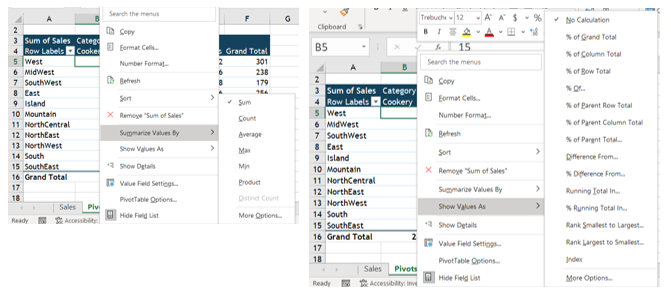
The Value field is data from the table that can be calculated (like money amounts), or that contain values that the Pivot table will be able to summarize. The Values field has multiple settings to choose how you want to calculate the data: SUM, COUNT, AVERAGE, MIN, MAX. This field can even show the displayed values as a percentage of the total, column total, grand total, and so on.
Lastly, in the Filters area, which restricts the Pivot table to only show the values matching specified criteria.
Four Primary Pivot table Areas:
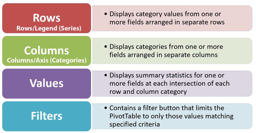
MedAttrib: Beginning to Intermediate Excel. MS Excel – Four Primary Pivot table Areas.
The point of a Pivot table is not to create new data, but to have a streamlined tool to filter and sort a summary of a larger dataset or basic table’s information in different ways for different chart and analysis focus.
Creating Pivot Tables
ACTION: Try Me activity
Let’s now work with an Excel file: Ch18–Pivots.xlsx. This is a dataset from Taste du Monde of products and their prices.
Example images of this activity appear in more than one part within this chapter.
Save a copy of Ch18–Pivots.xlsx to your Examples folder, then, open the copy file for work. There is one worksheet with a dataset in it. The dataset has not been converted to an Excel Table Object (basic table) and does not need to be for this task. The theme, color palette have already been set.
- Click the Sales sheet. Click anywhere in the dataset area. To create a Pivot table, the dataset needs to be active first, since this data is pulled into the Pivot table for summarizing options.
- From the Insert tab, choose Pivot table. In the dialog box that opens, you can see that Excel already selected the dataset area of cells.
- From the Create Pivot table dialogue box, make sure the Pivot table report will be placed in a New Worksheet, and click OK.
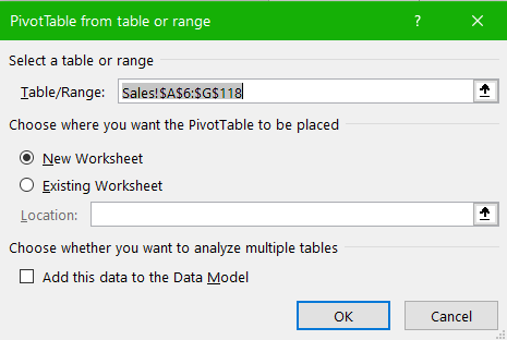
MedAttrib: author-generated. MS Excel Create Pivot Table dialogue box.
- Notice a new sheet (Sheet1) is inserted before the existing Sales sheet. It contains the Pivot table1 area and fields dialogue box. Rename the default name (Sheet 1) to RegionSales.
- Move the RegionSales sheet to follow the Sales sheet.
- Note which cell is the top left cell of the inserted Pivot table in your file. In my Excel experience/example it was cell A3. If yours is A2 or A4 or another A cell, then note and work with that basis when following the instructions below for the cell references for the example, and adjust for that. Or, you can remove/add rows to your workbook so that your RegionSales sheet’s Pivot table “starts” at cell A3. Dealer’s choice!
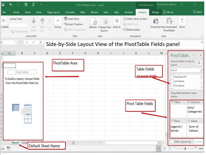
MedAttrib: Beginning to Intermediate Excel. Empty MS Excel Pivot Table Field pane.
When you first create a Pivot table to work on, Excel’s default is to also open a PivotTable Fields panel. This is an interface you can use for moving data around so that the Pivot table itself updates with rows and columns of information. This panel can have more than one layout – this chapter will demonstrate the side-by-side layout.
TIP: PivotTable Fields panel. The panel will appear and disappear from view when you click outside the active Pivot table. If you actually close the panel while working IN the Pivot table and then need the panel back, clicking in the pivot table will not automatically return it. You can get it back from the contextual PivotTable Analyze tab, the Show icon at the left, and choose Field List from the dropdown list.
- From the PivotTable Fields pane, drag and drop the Region heading to the Rows/Legend (Series) section of pane’s Pivot table fields area. This would be the Rows.
- From the PivotTable Fields pane, drag and drop the Category heading to the Columns/Axis (Categories) field section. Notice the categories display. This would be the Columns.
- From the PivotTable Fields pane, drag and drop the Sales heading to the Values section. There, it will read as Sum of Sales (the default).
- SAVE your work.
MedAttrib: author-generated. MS Excel Pivot table result and Fields panel.
What are we observing? (See ODDITY NOTE above)
- The Rows/Legend (Series) are the row headings, for the regions.
- The Columns/Axis (Categories) are the column headings for the categories of the products sold
- The data in the cells is a summarization of the sums of what was sold.
- A default Grand Total column shows the totals of each row.
- A default Grand Total row shows the totals of each column.
This table can be filtered to show specific categories, or specific regions. And, using the PivotTable Fields panel, it can “pivot” to other areas of focus for different row and column headings to summarize and analyze different data. THAT is what pivot means in Pivot table.
Let’s Pivot Filter the table’s data a bit, just temporarily.
- Click the Filter button in cell A4, and in the dropdown, deselect everything.
- Then select only the items in the list with West in them, and click OK. The Pivot table will filter the other regions out.
- Click the Filter button in cell A4, and in the dropdown, Select all., so that the table goes back the way it was.
Formatting Pivot Tables
After creating a Pivot table and adding the fields that you want to analyze, you will need to do some clean-up for the table to make sense. Sometimes the row or category headers don’t really state what you need, or the filter options in the pivot table’s subhead row seem confusing. You will likely need to also use some kind of data formatting for the content, since the pivot table info grabs the information, but not the numeric data formatting from the original dataset/basic table. You may also want to enhance the report to include slicers, or graphs for easier filtering.
- Click in the Pivot table area to activate it, to get access to a contextual Ribbon tab on the ribbon. This will contain a PivotTable Analyze tab and related Design tab.
The Analyze tab contains tools specifically for examining data. For example, it has the location for re-opening the PivotTables Fields panel, and the commands to insert Slicers, or illustrative Pivot charts. The Design tab contains tools that specifically tie to how the table (and charts) and data visibly display, sort of like the basic Table tab does for regular tables. For example, when you have a lot of data in your Pivot table, it may help to show banded rows or columns for easy scanning or to highlight important data to make it stand out. You will also need to add data formatting like currency, percentage, decimals, and other related types of data formatting to make it more readable.
NOTE: Interestingly, neither Pivot table-generated contextual ribbon/tab offers to option to change the Pivot table’s name. You can do this by clicking into the Pivot table to activate it, then right-clicking and selecting PivotTable Options from the dropdown list. That opens a PivotTable Options dialog window that has a space to change the Pivot table’s name and do all sorts of other things, like adding AltText (for screen readers to access), and showing or hiding Grand Totals for columns and rows.
Let’s clean up our Pivot table’s content.
- Right-click in the Pivot table, select the PivotTable Options from the dropdown list, and in the resulting PivotTable Options dialog window, change the table’s name to Category Sales by Region.
- Click cell B3 and look at the Active Field contents in the PivotTable Analyze tab. It reads Category, while the Table’s cell reads Column Labels.
- Overwrite cell B3 with the word Category. This will help make using the row’s filter to work with the data mean something.
- Click cell A4, and do the same thing to observe the Active Field contents in the PivotTable Analyze tab.
- Overtype cell A4 with Region.
- Right-click on Cell B5, and choose Number Format, then Accounting. ALL the number cells in the Pivot table convert to Accounting format, but this can look busy. Ideally, only the first row and the total row should show the Accounting format.
- Undo the last step with CTRL Z (Mac CMD Z). If you can’t, you can instead Right-click on Cell B5, and choose General Format.
- Select Cells B5-F5, and apply the Accounting format to only them using the Home ribbon Number group’s Accounting format.
- Select Cells B6-F15 and apply the Number format if the data does not already appear in number format.
- IF the format is not already at 2 decimal places, select Cells B6-B15, choose Home ribbon’s Number group, then apply the Increase Decimal by 2.
- In cells B16-F16, apply the Accounting format to only them, with 2 decimal points.
TIP: Summarizing and giving data values. You can right-click on any data cell in a Pivot table, and see various ways to summarize the data and to show those values (not format, but other actual value types. These will make more sense as you work with data in your career and determine the needs and what you want your pivot tables to do.
MedAttrib: author-generated. MS Excel Pivot table data format and value options.
Now that our Pivot table is more readable, let’s format the Pivot table itself. Taste du Monde uses a dark teal, a light green, and a tan as some of the signature colors and this file has already been set with the Berlin Theme with Aspect color palette. We want the table to be easy to read.
- Click in the Pivot table, then go to the Pivot table’s Design tab.
- In the pivot table Styles gallery select the Tan, Pivot Style Medium 21 format.
- SAVE your work.
Pivot Charts
Next, let’s create a pivot chart from this pivot table. The process is very similar to what we will learn later for regular charts and graphs.
- Click in the pivot table, then go the PivotTable Analyze tab.
- Choose the PivotChart button on the ribbon.
- From the listed chart types, choose Column and select the Clustered Column option. Click OK.
- Drag the pivot chart to the right so that it is not overlapping the table.
- To change the clustered style to another variation, click the chart, then on the Pivot chart Design ribbon. HERE, choose Change Chart Type, and select Clustered 3D Column.
Notice that when you click in the Pivot chart, an additional 3rd Pivot table contextual tab appears to the right of the Design one, called Format. This allows you to do micro formatting on the Pivot chart elements, like you would with other graphics in Excel.
Also, notice that (if you had the PivotTable Fields panel open) the PivotTable Fields panel now reads PivotCharts Fields.
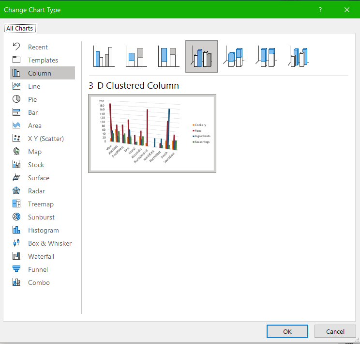
MedAttrib: author-generated. MS Excel 3D Clustered Column pivot chart.
Now, let’s filter something in the Pivot table, and observe what might happen to the related chart.
- Click cell B3’s Category filter button. From the dropdown, deselect Ingredients and Seasonings, then click OK.
- The table now summarizes only Food and Cookery, and the related Pivot chart adjusts automatically to focus on those as well.
- Click the Filter button in cell B3, and in the dropdown, Select all, so that the table goes back the way it was.
- SAVE your work.
Pivot a Pivot Table
Let’s keep this table and chart as is, and make a copy of the worksheet so we can try some other things with the table while leaving this RegionSales worksheet one intact.
- Right-click the RegionSales worksheet tab, choose Move or Copy, then checkmark the Copy checkbox.
- Keep the sheet in the same workbook and choose (move to end), then click OK.
- Name the new sheet SalesRep Sales Counts.
- Delete the pivot chart so that we only have the Pivot table.
- If the PivotChart Field List is no longer open on your screen, go to the contextual PivotTable Analyze tab, Show icon at the left, and choose Field List to open it.
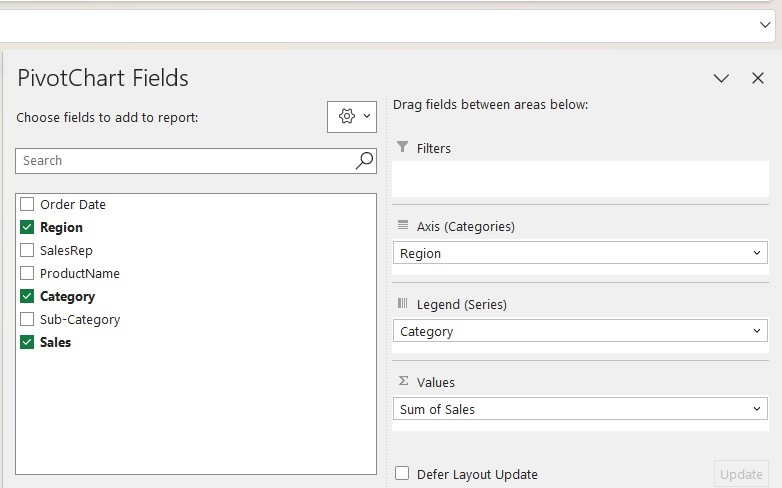
- In the Field List, uncheck Region and choose SalesRep.
- Keep the SalesReps in the Rows/Legend (Series) field.
- Keep the Category in the Columns/Axis (Categories) field.
- In the Values field, click the dropdown arrow, and choose Value Field Settings.
- In the Value_Field Settings, choose Count, instead of Sum, and give it the name SalesCount in the Custom Name field. Click OK.
Now you can see the Pivot table has pivoted to give different information. The numbers are counts of the number of items sold, not the price that was paid. The counts are attributed to the Sales Reps responsible for the region the products were purchased from.
There is a little problem, however. Consider cell A4, which reads Region. We had manually typed that in for the RegionSales worksheet’s Pivot table because the default phrase there was too general. However, in this worksheet’s newly pivoted table, that label no longer applies.
Look in the PivotTable Analyze tab’s Active field, and notice that it reads SalesRep. Overtype SalesRep into cell A4.
- Close the PivotChart Field List to make viewing room for the table.
This time let’s see if we can make a Pie Chart.
- Make sure you click into the Pivot table so it is active and shows the Pivot-related Ribbon tabs.
- Choose the PivotChart button on the PivotTable Analyze ribbon.
- From the listed chart types, select the Pie Chart option. Click OK.
- Drag the Pivot chart to the right so that it is not overlapping the table.
- The Pie Chart looks nice, but it refers to only Cookery. A Pie Chart can really only view one column at a time, but the pivot chart allows you to filter it with the small Category Button in its lower left corner.
- Click the pivot chart’s category button dropdown, and deselect all. Then choose only Ingredients. The pivot chart will change.
- SAVE your work.
TIP: Pivot filtering. To change the pivot chart’s focus, you can filter either the Pivot table or the pivot chart, since they are tied together.
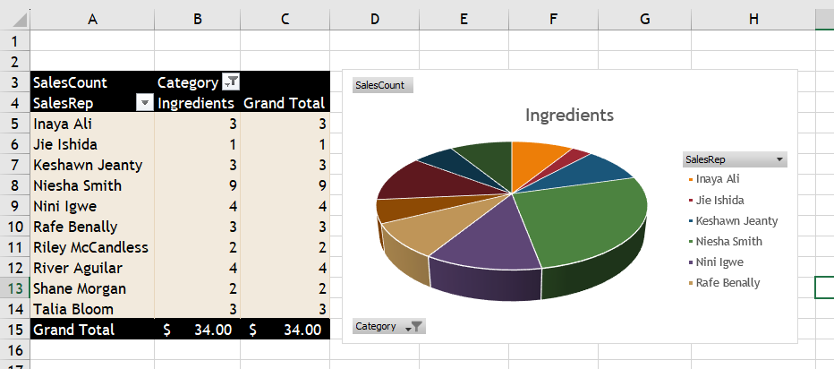
MedAttrib: author-generated. MS Excel pivot pie chart.
Slicers for Pivot Tables
One of the strengths of pivot tables is that you can ask questions of the data by using filters. Being able to identify and examine subgroups is a useful analytical tool; however, when using basic table and chart filters and autofilters, the user cannot always tell which subgroups have the filters and autofilters selected without clicking tiny and not very informative filter buttons. Slicers are easy-to-see buttons that you can add to your worksheet, and can click to filter the data in pivot tables and pivot charts to make the data easier to filter and interpret. With slicers, the subgroups are immediately identifiable and can be changed with a click of a button or buttons.
Why use slicers rather than row, column, or report filters? One effective way to analyze data is to use slicers to filter the data in more than one field at a time. They offer the following advantages over filtering directly in a pivot table:
- In a Pivot table, you use the filter button to specify how to filter the data, which involves a few steps. After you create a slicer, you can perform this same filtering task in one step.
- You can filter only one pivot table at a time, whereas you can connect slicers to more than one pivot table to filter data (advanced)
- Excel treats slicers as graphic objects, which means you can move, resize, and format them as you can any other graphic object. As graphic objects, they invite interaction.
- Slicers are intuitive—users without knowledge of Excel can use them to interact with the data without getting into the Pivot table, Pivot chart, or basic Excel table object.
- Slicers make it easy for users to understand exactly what is shown in a filtered Pivot table or Pivot chart.
Let’s add slicers to a Pivot table. We will do this with the SalesRep SalesCounts worksheet and related Pivot table, , with no Pivot chart the single-minded Pie chart filtering doesn’t respond well to Slider filter selections.
- Right-click the SalesRep SalesCounts worksheet tab, choose Move or Copy, then checkmark the Copy checkbox.
- Keep the sheet in the same workbook and checkmark (move to end), then click OK.
- Name the new sheet RepSales Slicers.
- Delete the existing Pivot chart so that we only have the Pivot table.
- If the PivotChart Field List is no longer open on your screen, go to the contextual PivotTable Analyze tab, Show icon at the left, and choose Field List to open it.
- Click on the Pivot table to Activate it, and in the PivotTable Fields panel, uncheck Region and choose SalesRep.
- Keep the SalesReps in the Rows/Legend (Series) field.
- Change the contents of cell A4 to read SalesRep.
- Click on the Pivot table, and go to the PivotTable Analyze ribbon Filter group.
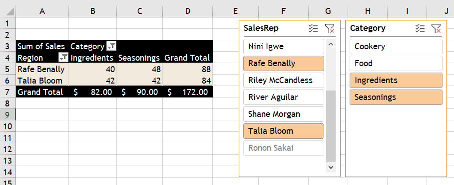
- Click on the Filter group’s Insert Slicer icon.
- In the Insert Sliders panel, choose only SalesRep and Category, then click OK.
- Two Slicer objects will appear near your pivot table, and will have all slicer buttons In them already selected.
- You can move one or both of these Slicer objects so they are to the right of your Pivot table, and easy to see.
- In the SalesRep slicer, deselect everyone but Talia Bloom (you may have to scroll).
- In the Category slicer, select only Ingredients and Seasonings.
- The Pivot table contents will change to show only Talia Bloom’s counts for Ingredients and Seasonings.
- In the SalesRep slicer, add Rafe Benally, and observe how the pivot table changes.
- SAVE your work. We are finished with this activity!
MedAttrib: author-generated. MS Excel pivot slicers that have been filtered.
If you decide to create a Pivot chart off of this Pivot table, 1) don’t select Pie chart, and 2) any changes in the Slicers will affect both the Pivot table and its Pivot chart.
More About Pivot Charts
If you need to make a change to the underlying data for a Pivot chart, you can click the Change Data Source button (PivotChart Analyze ribbon Data group. You also can refresh Pivot chart data after the change by clicking the Refresh button on the same ribbon.
As you have seen, Excel automatically creates a legend when you create a Pivot chart. The legend is from the fields in the Values area of the PivotChart Field panel. To move the legend in a Pivot chart, right-click the legend and then click Format Legend on the shortcut menu. The Format Legend pane will display options for placing the legend at various locations in the Pivot chart area.
As with tables and pivot tables, you can filter the data in a Pivot chart. Slicers used to filter a Pivot table will affect the related Pivot chart once you refresh the chart. Otherwise, any fields in the Columns/Axis (Categories) area of the PivotChart Field panel display as filter buttons in the lower-left corner of the Pivot chart area.
To filter a pivot chart, click one of those buttons; the resulting menu will allow you to sort, search, and select.
