Chapter 20: Chart/Graphs
What We’ll Cover >>>
- Charts/Graphs Concepts
- Bar Charts
- Line Charts
- Pie Charts
- Column Charts
- Doughnut Charts
- Sparklines
This section reviews a few of the most commonly used Excel chart types. There are actually more, but they can be very specialized and require datasets beyond the basics/intermediate level, for particular workflows and industries. To demonstrate the variety of chart types available in Excel here, it is necessary to use a variety of data sets. This is necessary not only to demonstrate the construction of charts but also to explain how to choose the right type of chart given your data and the idea you intend to communicate.
Charts/Graphs Concepts
Before we begin, let’s review a few key points you need to consider before creating any chart in Excel. A chart or graph should exist to clearly demonstrate the analysis of some data in a way that makes sense to the audience, A chart isn’t meant to be a static graphic; it needs to communicate something that the viewers need while making a decision and considering actions to take. Is it showing a comparison, or a trend, or a problem in numbers, etc.?
The concepts of chart and graph tend to be used interchangeably, but they have slight differences.
Chart: Tables, diagrams or pictures that organize large amounts of data clearly and concisely, like in bars, pies, columns, etc.
Graph: Graphs tend to focus on raw data and show trends over time, such as with scatters, line charts, trendlines, etc.
First, you need to determine which kind of chart to use.
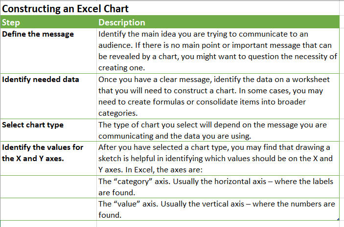
- The first key point is to identify your idea or message. It is important to keep in mind that the primary purpose of a chart is to present quantitative information to an audience in a visual way. Therefore, you must first decide what message or idea you wish to present. This is critical in helping you select specific data from a worksheet that will be used in a chart.
- The second key point is to select the right chart type. The chart type you select will depend on the data you have and the message you intend to communicate. Some tables or pivot tables may not be better explained/visualized with a chart or graph.
- The third key point is to identify the values that should appear on the X and Y axes. One of the ways to identify which values belong on the X and Y axes is to sketch the chart on paper first. If you can visualize what your chart is supposed to look like, you will have an easier time selecting information correctly and using Excel to construct an effective chart that accurately communicates your message.
Chart/Graph Tips
- X-Axis on a chart: When using line charts in Excel, keep in mind that anything placed on the X-axis is considered a descriptive label, not a numeric value. This is an example of a category axis. This is important because there will never be a change in the spacing of any items placed on the X-axis of a line chart. If you need to create a chart using numeric data on the category axis, you will have to modify the chart. We will do that later in the chapter.
- Y-Axis Scale: After creating an Excel chart, you may find it necessary to adjust the scale of the Y-axis. Excel automatically sets the maximum value for the Y-axis based on the data used to create the chart. The minimum value is usually set to zero. That is usually a good thing. However, depending on the data you are using to create the chart, setting the minimum value to zero can substantially minimize the graphical presentation of a trend.
- Carefully Select Data When Creating a Chart: Just because you have data in a worksheet does not mean it must all be placed onto a chart. When creating a chart, it is common for only specific data points to be used. You might need to create a named data range, or a pivot table, in order to narrow down the data to be charted.
MedAttrib: author-generated. MS Excel Chart planning.
Types of graphs/charts
- Area: Like a line chart but with the area below the line filled in. Highlights magnitude of change over time.
- Bar: highlights individual figures at a specific time or indicates variations between components – but not in relationship to the whole.
- Box & Whisker: Displays medians, quartiles, and extremes of a data set on a number line to show the distribution of data. Lines appearing vertically are called whiskers and show variability outside the upper and lower quartiles.
- Column: Values are shown in vertical bars in a way that can compare items or show how values vary over time.
- Combo: Combines two or more chart types to make data easier to comprehend.
- Funnel: Displays values over multiple stages of a process; because the values generally decrease, the shape of the chart resembles a funnel.
- Histogram: Condenses a data series into a visual representation by grouping data points into ranges named bins.
- Line: Displays trends and overall change across time at even intervals, with an emphasis on the rate of change, rather than the magnitude.
- Map: Compares values and shows categories across geographical regions.
- Pie/Donut: Shows proportions of data and the relationship of the parts to the whole (like percentages of 100%).
- Radar: Accentuates differences and amounts of change over time as well as variations and trends. Each category has a value axis radiating from the center point with lines that connect all values in the same series.
- Stock: Shows the four values for a stock: open, high, low, and close.
- Sunburst: Shows hierarchical data with each level represented by one ring. The innermost ring leads the hierarchy.
- Surface: Exhibits trends in values across two dimensions, in a continuous curve.
- Treemap: Offers a hierarchical view of data with proportions comparison within the hierarchy.
- Waterfall: Presents how an initial value is affected by a series of positive and negative values.
- X Y (Scatter): Demonstrates the relationships among numeric values in several data series, or plots interception points between x and y values.
Example Chart Decisions
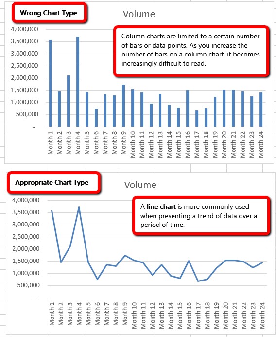
The data this example comes from has generally too many data points to put on a column chart, which looks hard to interpret. A line chart can show changes in a more clear way.
MedAttrib: Beginning to Intermediate Excel. MS Excel Chart Types.
Line Chart vs. Column Chart
We can use both a line chart and a column chart to illustrate a trend over time. However, a line chart is far more effective when there are many periods of time being measured. For example, if we are measuring fifty two weeks, a column chart would require fifty-two bars. A general rule of thumb is to use a column chart when twenty bars or fewer are required and there is enough room for the whole chart to be very readable. A column chart actually becomes difficult to read as the number of bars exceeds twelve or so, and twenty should be an upper limit.
Column Chart vs. Bar Chart
When using charts to show frequency distributions, the difference between a column chart and a bar chart is really a matter of preference. Both are very effective in showing frequency distributions. However, if you are showing a trend over a period of time, a column chart is preferred over a bar chart. This is because a period of time is typically shown horizontally, with the oldest date on the far left and the newest date on the far right. Therefore, the descriptive categories for the chart would have to fall on the horizontal – or category axis, which is the configuration of a column chart. On a bar chart, the descriptive categories are displayed on the vertical axis.
Trendlines
Using a trendline on certain Excel charts allows you to illustrate the behavior of a set of data to determine if there is a pattern. Trends most often are thought about in terms of how a value changes over time, but trends also can describe the relationship between two variables, such as height and weight. In Excel, you can add a trendline to most types of charts, such as unstacked 2-D area, bar, column, line, inventory, scatter (X, Y), and bubble charts, among others. Chart types that do not examine the relationship between two variables, such as pie and doughnut charts that examine the contribution of different parts to a whole, cannot include trendlines.
Note that many chart types are specific to particular types of data, not for general use. Data management focuses on skills-building for work in that data management and analysis area, like statistics, finance, mathematics, scientific, etc. In this chapter, we will focus on a few common charts you might come across in school assignments or routine workplace needs.
ACTION: Try Me activity
Let’s now work with an Excel file: Ch20–Charts.xlsx. This is a dataset from Prisvard Tech, with various aspects of data we can use. Before starting work, save a copy of Ch20–Charts.xlsx to your Examples folder. Then, open that file for work.
We’ll be completing several charts, and the images will appear through the chapter.
There are 6 worksheets. We will work through each sheet for one chart type at a time, and place the finished chart for each on the same worksheet the data for it is on.
Bar Charts
A bar or column chart is commonly used to show trends over time, as long as the data are limited to approximately twenty points or less.
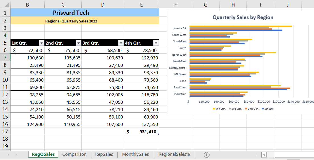
The Ch20–Charts.xlsx first sheet is for quarterly sales by region. This kind of data can be expressed in a bar chart, to highlight individual figures at a specific time.
Go to the RegQSales worksheet. This sheet expresses regional sales by quarter in an Excel table object with a total row. We’ll start by determining if Excel recommends a frequency distribution chart, instead of going and looking for one ourselves.
- Click the table and go to the Insert ribbon, Charts group, and select Recommended Charts. Recommended charts offers both column and bar chart options.
- Choose the Clustered Bar chart, then click OK.
- A chart appears, floating over our data. Drag it so that its upper left corner is around cell F1, so that we can see it and some of the data.
Click on the Bar chart. Notice that when you do, the table is subtly highlighted to indicate that the left column (regions) is in use in the chart, and that the numeric data is also being referenced in the chart
- Drag the Bar chart’s lower right-hand border to increase the chart size for better review.
Interestingly, the Bar chart does not have a title. Excel recognizes the data is a frequency distribution, but can’t determine what emphasis the chart should be named after. You will need to decide.
- Click in the Bar chart’s Chart Title text box, and type Quarterly Sales by Region.
- Click anywhere in the chart to select it, and observe how a contextual Chart Design ribbon and related Format ribbon appear to the right of the other Excel ribbons.
- In the Chart Design ribbon, Chart Styles group, hover your cursor over the various styles for this Bar chart, and choose one that seems easy to view and interpret.
- In the Chart Design ribbon, Chart Styles group, choose Change colors, and see if there is a multi-colored palette that works for you. Hint: it is not recommended to use monochromatic (single color) color blends for a clustered chart, because they can blend together and be difficult to distinguish.
- SAVE your work.
We don’t need to do any more with this chart, but let’s interpret it. We are seeing a display of sales in each region, compared to each other for each quarter of the year. Some regions have lower sales. The 4th quarter sales seems to be consistently the highest, likely due to end-of-year/holiday spending.
MedAttrib: author-generated. MS Excel bar chart.
Line Charts
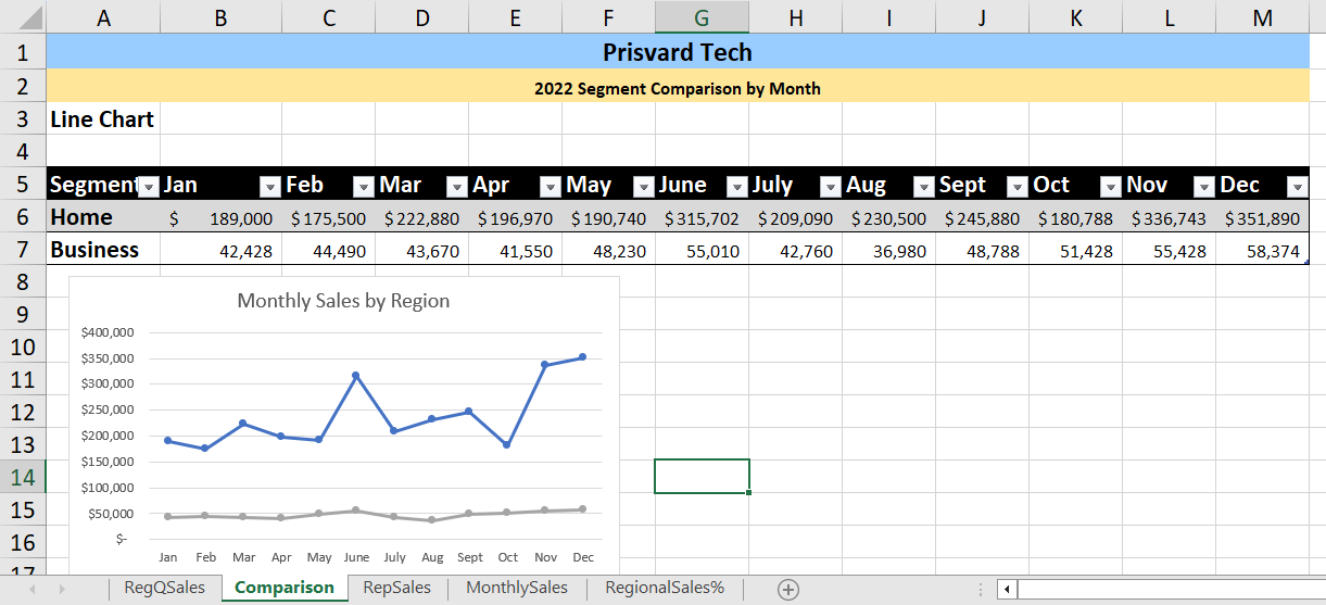
The second Ch20–Charts.xlsx worksheet, named Comparison, compares monthly sales data for two segments that Prisvard Tech serves. This kind of data can be expressed in a line chart, to display trends and overall change across time at even intervals (in this case months).
- Go to the Comparison worksheet. Let’s find out if Excel recommends a chart type.
- Click the table and go to the Insert ribbon, Charts group, and select Recommended Charts. Interestingly, Recommended charts offers mostly bar and column options. We don’t want that, so in the Insert Chart panel, select the All Charts tab and look for a Line chart.
- In the Line chart selection, choose the Line with Markers option, and the preview chart on the right-side of the preview. Then click OK.
- Excel will place the Line chart on the Comparison worksheet, and you may need to drag it below the table, so it doesn’t cover the data.
Again, the created chart does not have a title.
- Click in the Line chart’s Chart Title text box, and type Quarterly Sales by Region.
- The Line chart uses colors that Prisvard tech doesn’t favor; in the Chart Design ribbon, Chart Styles group, hover your cursor over the various styles for this Line Chart.
- Choose Colorful palette 2.
- SAVE your work.
We don’t need to do any more with this Line chart, but let’s interpret it. It seems as if there has been more movement and variation in the sales of products to customers of the home segment than there was for those in the business segment.
MedAttrib: author-generated. MS Excel line chart.
Pie Charts
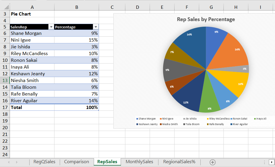
The third Ch20–Charts.xlsx worksheet, named RepSales, shows the Sales Reps and their regions, and what percentage of all sales they were responsible for. This kind of data can be expressed in a doughnut or pie chart to reveal proportions of data compared to the whole. Because there are more than three or four sales reps, a Pie chart might work well.
- Go to the RepSales worksheet, click the table and go to the Insert ribbon, Charts group, and select the Insert Pie or Donut (spelled out Doughnut) Chart icon.
- In the flyout selection, choose the Pie, then click OK.
- Drag the Pie chart to the right so that it doesn’t cover the table data.
- In the Percentage text box (which is the chart title), type Rep Sales by Percentage.
- Click on the Pie chart, and go to the Chart Design format ribbon. In the ribbon, set the width to 8 inches and the height to 5 inches.
- Click on the Pie chart, and go to the Chart Design ribbon, and choose the Chart Style 11, which will add data labels for us.
- SAVE your work.
We don’t need to do any more with this Pie chart, but let’s interpret it. This chart only displays the percentages of overall sales by sales rep. It doesn’t offer insight as to why, so it might be a useful supporting chart but something else would have to give more context, such as a detailed caption with a description, or a different chart type.
MedAttrib: author-generated. MS Excel pie chart.
Column Charts
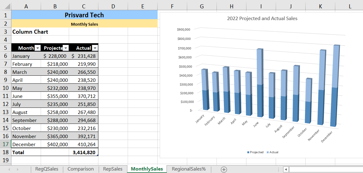
The fourth Ch20–Charts.xlsx worksheet, named MonthlySales, shows the actual sales by month, compared to the projected sales. This kind of data can be expressed in a column or bar chart to show trends over time (months). We’ve done a Bar chart, so let’s do a Column chart here.
- Go to the MonthlySales worksheet, click the table and go to the Insert ribbon, Charts group, and select the Recommended Charts icon.
- In the selection, choose the Stacked Column chart, then click OK.
- Drag the Column chart to the right so that it doesn’t cover the table data.
- Click in the Column chart’s Chart Title text box, and type 2022 Projected and Actual Sales.
- Let’s change the colors on this chart, and make it 3-dimensional so it pops out a bit more.
- Click on the Column chart, and go to the Chart Design ribbon. In the ribbon, select Change Chart Type.
- In the Chart Type preview area for Column charts, choose the 3-D Stacked Column, the preview on the left, and click OK.
- Click on the Column chart, and go to the Chart Design ribbon, then choose Change Colors. Here, a monochromatic selection will work; choose the bottom blue monochromatic palette.
- SAVE your work.
We don’t need to do any more with this Column chart, but let’s interpret it. The stacked format shows a comparison between the projected and actual sales of each month. In this case, a clustered chart actually might make more sense, in order to see side-by-side differences between the projected and actual sales.
MedAttrib: author-generated. MS Excel stacked column chart.
Doughnut Charts
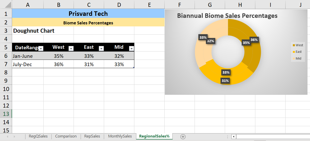
The fifth Ch20–Charts.xlsx worksheet, named RegionalSales%, displays a percentage of sales per Prisvard Tech’s biomes (West, East, Mid country). This kind of data can be expressed in a pie or doughnut chart to show percentages of data compared to the whole. In this case, there are only 3 regions, which may be better represented in a doughnut chart; a pie chart would focus on the two date ranges, whereas a doughnut chart can focus on the three biomes.
- Go to the RegionalSales% worksheet, click the table and go to the Insert ribbon, Charts group, and select the Insert Pie or Doughnut Chart icon.
- In the flyout selection, choose the Doughnut, then click OK.
- Drag the Doughnut chart to the right so that it doesn’t cover the table data.
- Click on the Doughnut chart, and go to the Chart Design ribbon, and choose the Chart Style 3, which will add data labels for us.
- Click on the Doughnut chart, and go to the Chart Design ribbon, Chart Layouts group.
- Then, click on the Add Chart Element icon, choose Chart Title, and then choose Centered Overlay.
- Click on the Chart Title text box, and drag it just above the top of the doughnut.
- In the Chart Title text box, type Biannual Biome Sales Percentages.
- Click the Doughnut chart, go to the Chart Design ribbon, Data group, and click the Switch Row/Column. This will change the legend to the regions from the existing date ranges.
- Click the Doughnut chart, go to the Chart Design ribbon, and choose the Change Colors icon.
- Choose the Yellow monochromatic palette.
- SAVE your work.
We don’t need to do any more with this chart, but let’s interpret it. This chart displays the percentages of sales over two ranges within the year, and over three biomes. It doesn’t offer insight as to why, but doesn’t really need more information to interpret it. The monochromatic colors, however, don’t have the clearest edges to separate the date ranges.
MedAttrib: author-generated. MS Excel doughnut chart.
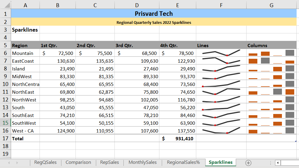
Sparklines
Sparklines are miniature charts that can be embedded into the background of a cell. Entire sparkline charts exist within single cells. Since Sparklines can be placed directly next to the data set being represented, viewing them allows the quick determination of trends or patterns within the data without looking at a separate chart. Consider using Sparklines to illustrate high and low values within a range, as well as trends and other patterns
The sixth Ch20–Charts.xlsx worksheet, named Sparklines, has a table that replicates the RegQSales table from the first worksheet, although this table is colorized in grays, not black. This kind of data can be expressed with Sparklines, because Sparklines consider data over a period of time (like 4 quarters) and present a line chart, or a bar chart, for it. In the case of Sparklines, these charts actually fill in the cells of the table next to the data, rather than being created as a separate chart object. Because of this, you can also type in the cells with the Sparklines; the text will float over the lines, or the column can be widened to the text and Sparklines can have enough room to be viewed clearly.
Sparklines first have to be added to new, empty cells.
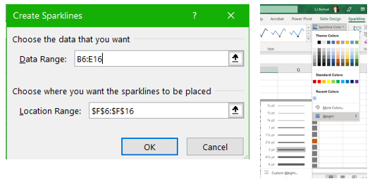
In the Sparklines sheet of Ch20–Charts.xlsx, select the cells F6-F16, which are empty and just to the right of the 4th Qtr data. These cells are already “in the table” since this worksheet already has a column header for Lines, and another column header to its right for Columns.
- After selecting cells F6-F16, use the Insert ribbon’s Sparklines group to choose the Line icon. A Create Sparklines dialog box opens.
The Location range is already filled with the cells you have selected in the F column: $F$6:$F$16
- In the Data Range, select cells B6:E16 (not the totals row). This allows the Sparklines to summarize the Region quarterly data. for rows 6-16.
- Click OK.
Column F will now show sparklines in each cell of rows 6-16. Let’s make them more visually striking for easier viewing.
- Click on one of the Sparkline cells to activate it, and a contextual Sparklines ribbon will appear in the Excel ribbons area.
- Click the Sparkline Color icon on the ribbon.
- In the dropdown menu, select Weight, so we can make the Sparkline more prominent.
- In the Weight dropdown, choose 3pt.
- In the Sparkline ribbon, Show group, put a checkmark in the High point and the Low point checkboxes.
- In the Sparkline ribbon Style group, select the Red Sparkline Style Dark 3.
- SAVE your work.
MedAttrib: author-generated. MS Excel Create Sparklines and Sparklines ribbon options.
Let’s repeat most of these steps to add a Column Sparkline element to column G.
- Select cells G6-G16, and use the Insert ribbon’s Sparklines group to choose the Column icon. A Create Sparklines dialog box opens.
The Location range is already filled with $G$6:$G$16.
- In the Data Range, select cells B6:E16.
- Click OK.
- In the Sparkline ribbon, Show group, put a checkmark in the High point checkbox. The high point will now show as a gray, rather than brownish colored column.
- In the Styles group, choose the Brown Sparkline Style Accent 2 Darker 25%.
- SAVE your work and close the file. We’re done!
MedAttrib: author-generated. MS Excel Sparklines example.
