3 Maps and Models
GRAPHICACY
Literacy refers to the ability to read, write, and use words. Geographers often find it more efficient to convey concepts by using maps and diagrams. Graphicacy refers to the ability to effectively use, interpret, and make maps and diagrams. The sciences regularly use diagrams. Sometimes the author of a diagram is deliberately trying to manipulate the interpretation of data by choosing a specific design of diagram. A graphically literate person should recognize the shortfalls and advantages of different types of diagrams. A graphically literate person can “read” images.
Maps are a specific type of image. Maps show how data and characteristics change across space. All geographic data has a spatial component. It must have some type of location information associated with the data. A column graph showing two or more cities and their corresponding burglary rates is a valid graphical depiction of geographic data. The geographic location data is each of the cities. However, as you plot more and more cities on the column graph, it becomes more difficult to read. Good graphics should make it easier for the user to get the desired information. Plotting several dozen, or several thousand, cities on a single column graph would become incomprehensible. A map is much easier to read.
MODELS
Maps are models of reality. As models, they simplify and generalize the actual situation. Map makers, called cartographers, must decide on the intended purpose of the map in order to determine what data is necessary to achieve the intended purpose. Data that is unnecessary or distracting should be removed. For instance a highway map of an entire state will not show individual trees because the trees are not necessary for determining the routes along roadways.
SCALE
Scale is the degree of generalization of a map. There are three ways of indicating map scale: verbal scale, representative fraction, and graphical scale. The verbal scale is an old form, rarely used since about WWII. It is simply writing the scale in words: “One inch is approximately six miles”.
The representative fraction (RF) scale is mathematically consistent across the map. To use the RF scale, you must have a ruler. The RF scale is written as a ratio (1:24,000) where there first number is always ‘1’ and is the distance measured with a ruler on the map. Multiply that number by the second number (in the example it’s 24,000) to find the true ground distance. Remember to consider significant figures when using the RF scale. The result is the actual ground distance between the two points, with the same units as you used with the ruler. Notice the RF scale has no units in it, so whichever units you use when measuring on the map (mm or cm or inches) is the same units on the ground.
An example: What is the ground distance between two intersection shown on a map?Map distance between intersections (use ruler): 4 inchesThe map has an RF scale of 1:24,000.
(map distance ) x (RF scale) = (ground distance)
4 inches × 24,000 = 96,000 inches between the two intersections on the ground.
The third scale is a graphical scale. This is especially common in the era of photo copiers. If a paper map is photographically enlarged or reduced, but the graphical scale is included in the same process, then the graphical scale is still accurate whereas the verbal and RF scales are no longer accurate after enlarging or reducing.

To use a graphical scale, a ruler may be used, but it’s not necessary. Any piece of paper will work. Place the edge of the paper along a line between the two points of interest and mark their locations on the edge of the paper. Now bring the paper to the graphical scale and note where the two points align on the scale.
Different maps have different scales. Maps are either large scale or small scale. There is no predefined limit where small scale shifts to large scale. It is a relative term. One map is smaller scale compared to (in relation to) a second map. Larger scale maps show less area in more detail than smaller scale maps. This is easier to explain using the RF scale. A map of RF scale 1:2 shows more detail than a map with scale 1:4. The first map is a larger scale than the second map. Mathematically, 1/2 is greater than 1/4. When we talk about large- and small-scale maps and geographic data, then, we are talking about the relative sizes and levels of detail of the features represented in the data. In general, the larger the map scale, the more detail is shown. Photographs and images do not have consistent scale throughout the entire displayed area. This can be corrected mathematically so that a single scale is correct. The correction, called orthorectification, alters the image so it appears as if the map user is directly overhead of all points on the map rather than overhead of one point and viewing other points from a slight angle. USGS topographic maps are developed from images that have been orthorectified.
SYMBOLS
Maps contain symbols to represent different portions of reality. Common types of symbols are point, line, and area symbols.
All three classes of symbols have variations that are better able to indicate changes in either quantity or quality of the represented characteristic. Quantity is often shown by changing the size of the symbol. If a circle represents a town, a larger circle indicates a larger population. To show different types of features (changes in quality), the shape of the symbol is changed. A circle can be a town, a small airplane represents an airport, and an anchor could be a harbor. Color intensity (shading) is often used for quantitative change, but changes in color hue (red or green) generally indicate a change quality.

As the scale and generalization of maps change, some symbolic representations of reality might change. For instance a small scale map of Iowa that is printed in a notebook would probably use a point symbol to indicate the location of cities. But a map of Des Moines, IA on the same size piece of paper would use an area symbol for the entire city.
MAP TYPES
Scales and symbols are used in all types of maps. Maps are broadly categorized as either reference maps or as thematic maps. Reference map display a broad range of characteristics and try to give equal value to all of them. Topographic maps are a type of reference map that depict the lay of the land, including elevation and water bodies. Thematic maps often ignore the topography and landforms to better show other characteristics.
POINTS OF VIEW
Most maps are probably drawn in map view. (Stunning statement!) This is the overhead, from above, view. It’s a good choice for showing how a characteristic changes or moves horizontally. US State highway maps are drawn in map view.
A profile view shows the vertical change of a characteristic. When you stand on the ground and look at buildings from the base to the roof, you’re looking at their profile.
 |
 |
TOPOGRAPHIC MAPS
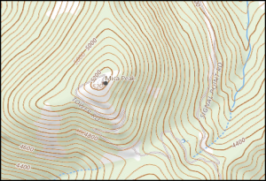
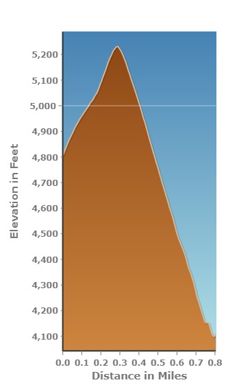
Topographic maps use contour lines to indication elevation. In the map above and left, the contour lines are a brown color. Contour lines are a specific type of isoline. In general, isolines connect points of equal value. The value can be land surface elevation, depth to the lake or ocean floor, average annual precipitation, or depth of snow in a storm, for a few examples. When isolines are close together, there is a greater change in the characteristic over a short distance. When contour lines are close together, the land surface has a steeper slope. Proficiency with isolines is an important geographic skill. The image below shows how placement of isolines helps indicate slopes.

Isolines are also approximations of reality. A weather map of the entire state seems to tell you what the temperature is at all points. In fact, the temperature was measured only in a few locations and estimates of the temperature for all other points are indicated with the isolines. Isolines indicating temperature are called isotherms. The same process is used to make topographic maps. The USGS has a large number of points with known elevation and location. Using these points, called benchmarks, as a starting point, contours are drawn to indicate the slope of the land surface.

Examples of Thematic Maps |
||
|---|---|---|
 |
 |
|
THEMATIC MAPS
The two maps shown above are both thematic maps. Neither map shows landforms. The map on the left shows how languages were distributed spatially across North America, while the map on the right is showing how crime rates vary by state. They are both good maps. The language map uses color well because no single color stands out as more significant, all colors have the same shade indicating that all languages have similar importance. However, the map reader must beware that languages don’t change as abruptly as the the map might indicate. As you move from southern Minnesota to northern Minnesota, don’t expect an abrupt change in spoken languages from Sioux to Algic. Although such an abrupt change is possible, it isn’t necessarily the case.
The craft brewery map is good because it uses shades of a single color and the data has been processed properly. The map shows how a single data set (Craft Breweries per capita) changes so it uses a single color in different shades. People naturally associate darker shades with more of a value so the dark blue indicates that the Pacific Northwest has a more breweries per capita. The cartographer also processed the data to improve comparisons among states with different populations and population density. Good choropleth maps such as this use preexisting political boundaries (countries, states, counties) and show data in forms such as breweries per consistent number of people (per capita) or as per consistent unit of area (per mi2 ).
Summary
Maps are models that simplify and generalize the real world. The amount of generalization is the scale of the map. Good use of map symbols can improve the interpretation of the map. There are broad categories of maps that are better suited to demonstrating broad categories of data.
