4 Map Projections
INTRODUCTION
Cartographers have known for centuries that the Mercator projection isn’t an especially accurate way of viewing the world, and they’ve developed a number of mathematical tools for projecting the earth’s spherical surface onto a two-dimensional map. But there’s no such thing as a perfect map projection! Every projection has its advantages and disadvantages. To understand why, we have to venture back into mathematics.
PROPERTIES OF MAP PROJECTIONS
Let’s consider what an ideal map would look like.
First, the map should be contiguous — there shouldn’t be any interruptions in it. Just as any two points on the earth’s surface can be connected by a line, someone should be able to draw a line between any two points on the map. We don’t, in other words, want something like this:

For the remainder of this discussion we’re going to consider only contiguous maps — maps that preserve topological characteristics.
In drawing these maps, there are four properties of the earth’s surface we’d like to preserve.
- Shape
- Shapes of regions should be drawn correctly, which means we have to preserve local angles — all angles at any point are preserved, the scale at any point is the same in every direction, and lines of latitude and longitude intersect at right angles. Maps that do this are called conformal maps.
- Area
- The areas of regions on the map should be proportional to their areas on the earth’s surface. Maps that preserve relative areas of regions are called equal-area maps.
- Distance
- Distances between points on the map should be proportional to the distances between those points on the earth’s surface. Maps that preserve distance are called equidistant maps.
- Direction
- Directions from the center of the map to various points on the map should be shown correctly. Maps that do this are called azimuthal maps.
The problem is that achieving all four of these properties on a two-dimensional map is impossible. Mathematicians have proven this. Preserving any one requires distorting at least one other. (This makes cartographers SADD.)
DISTORTION ELLIPSES
Many types of map projections have been devised to suit particular purposes. No projection allows us to flatten the globe without distorting it, however. Distortion ellipses help us to visualize what type of distortion a map projection has caused, how much distortion has occurred, and where it has occurred. The ellipses show how imaginary circles on the globe are deformed as a result of a particular projection. If no distortion had occurred in the process of projecting the map shown below in Figure 2.29.1, all of the ellipses would be the same size, and circular in shape.
When positions on the graticule are transformed to positions on a projected grid, four types of distortion can occur: distortion of sizes, angles, distances, and directions. Map projections that avoid one or more of these types of distortion are said to preserve certain properties of the globe.
Equivalence
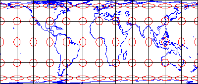
So-called equal-area projections maintain correct proportions in the sizes of areas on the globe and corresponding areas on the projected grid (allowing for differences in scale, of course). Notice that the shapes of the ellipses in the Cylindrical Equal Area projection above (Figure 2.29.1) are distorted, but the areas each one occupies are equivalent. Equal-area projections are preferred for small-scale thematic mapping, especially when map viewers are expected to compare sizes of area features like countries and continents.
Conformality
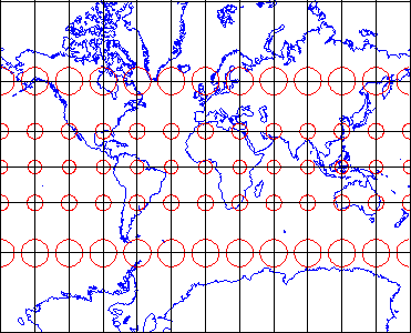
The distortion ellipses plotted on the conformal projection shown above in Figure 2.29.2 vary substantially in size, but are all the same circular shape. The consistent shapes indicate that conformal projections (like this Mercator projection of the world) preserve the fidelity of angle measurements from the globe to the plane. In other words, an angle measured by a land surveyor anywhere on the Earth’s surface can be plotted on at its corresponding location on a conformal projection without distortion. This useful property accounts for the fact that conformal projections are almost always used as the basis for large scale surveying and mapping. Among the most widely used conformal projections are the Transverse Mercator, Lambert Conformal Conic, and Polar Stereographic.
Conformality and equivalence are mutually exclusive properties. Whereas equal-area projections distort shapes while preserving fidelity of sizes, conformal projections distort sizes in the process of preserving shapes.
Equidistance
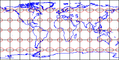
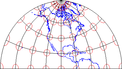
Equidistant map projections allow distances to be measured accurately along straight lines radiating from one or two points only. Notice that ellipses plotted on the Cylindrical Equidistant (Plate Carrée) projection shown above (Figure 2.29.3) vary in both shape and size. The north-south axis of every ellipse is the same length, however. This shows that distances are true-to-scale along every meridian; in other words, the property of equidistance is preserved from the two poles. See chapters 11 and 12 of the online publication Matching the Map Projection to the Need to see how projections can be customized to facilitate distance measurements and to effectively depict ranges and rings of activity.
Azimuthality
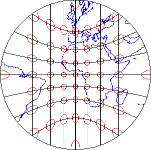
Azimuthal projections preserve directions (azimuths) from one or two points to all other points on the map. See how the ellipses plotted on the gnomonic projection, shown above in Figure 2.29.4, vary in size and shape, but are all oriented toward the center of the projection? In this example, that’s the one point at which directions measured on the globe are not distorted on the projected graticule.
Compromise
Some map projections preserve none of the properties described above, but instead seek a compromise that minimizes distortion of all kinds. The example shown above in Figure 2.29.5 is the Polyconic projection, which was used by the U.S. Geological Survey for many years as the basis of its topographic quadrangle map series until it was superceded by the conformal Transverse Mercator. Another example is the Robinson projection, which is often used for small-scale thematic maps of the world.
TYPES OF PROJECTIONS
Mapmakers and mathematicians have invented dozens of map projections — the possibilities are almost limitless. As new needs arise — such as the need to project satellite imagery onto a computer screen with minimal distortion — new projections are invented.
Most older and common projections are one of these three developable surfaces. Developable surfaces can be transformed from 2D to 3D back to 2D by joining or cutting along a straight line.
CYLINDRICAL
Cylindrical projections unwrap the earth’s surface and project it onto the surface of a cylinder. The Mercator projection is cylindrical, as are several variations of it. This is the only projection that can show the entire world, except the poles, since the other two types can only show one hemisphere. This is the oldest projection and its greatest advantage is that a straight line between any two points is the true direction between them. The problem is the distance and area is inconsistent as you move around the map.

CONICAL
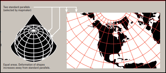
In a conical projection, the earth’s surface is mathematically projected onto a cone. This is often used to show large regions in the mid-latitudes such as the entire US. The US National Map by the USGS uses this projection.
PLANAR (or AZIMUTHAL)
An azimuthal projection geometrically maps the earth’s surface onto a plane. This is often used to show the distance from any direction to a single point. A city tourism bureau might use this projection with the city in the middle and circles around the city to indicate distance. Distances from any point to the center are correct but not from any other pair of points.
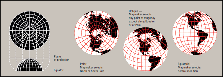
Cylindrical, Conical, and Planar projections are all developable surfaces. The planar projection is already a flat surface while the cylindrical and conical surfaces are 3D surfaces that can be cut in a straight line to yield a plane. The figures above show the most basic forms of each projection, but common changes to each projection include: slicing through the globe so the shape intersect the globe at more points, or angling the shape so it touches the globe at a different location.
PROJECTIONS AND PROPAGANDA
Interestingly, until the mid-twentieth century, publishers of maps and textbooks resisted using new projections (many of which were, by then, quite old). Why? Maybe because they wanted to stick with what was familiar to people — or maybe because Mercator fills a rectangular page so neatly and they didn’t want to waste all that space in the corners.
Mercator does have its advantages, of course. It’s perfect for wayfinding; it’s the only projection for which straight lines on the map represent constant directions on the earth’s surface. If point A is directly below point B on the map, then point A is due south of point B. But Mercator’s distortions make it less than ideal for studying geography.
MERCATOR TROUBLE
Because Mercator misrepresents the true areas of nations and continents, it can lead to misunderstanding — intentional or unintentional. Here are two ways that Mercator promoted particular political interests in the second half of the twentieth century.
THE COLD WAR
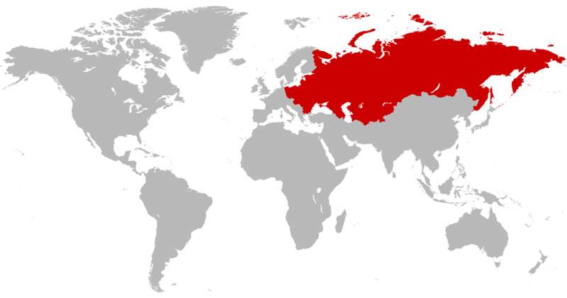
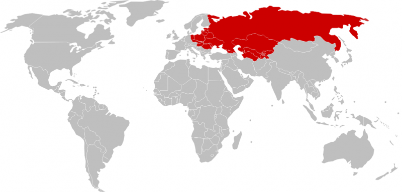
During the Cold War, maps of “us” and “them” were often drawn to emphasize the threat represented by the USSR and its allies. The Mercator projection was the perfect choice for anti-communist cartographers: because the USSR was at such high latitudes, Mercator stretches it out of proportion to its true size. In the map below, the nations become a sprawling red menace:
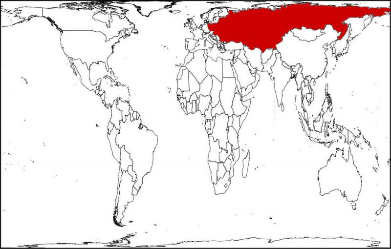
Redrawn in Robinson projection — a popular compromise between equal-area and conformal mapping — the USSR becomes a little less menacing.
Now redraw it again in the Peters equal-area projection, and the USSR shrinks to its true size.
Suppose you were a U.S. voter in 1960. Which of these would be most likely to make you support an increase in military spending?
If that didn’t convince you, cartographers could always offer a new perspective, as Time’s cartographer, R. M. Chapin, did in 1952:

From this perspective, it’s easy to imagine (red) armies sweeping across Western Europe.
NORTH AND SOUTH
One reason that Mercator wasn’t replaced sooner is that its distortions make the world’s most powerful nations appear larger, while poorer nations nearer the equator shrink. By the middle of the twentieth century, many people were pointing out that the Mercator projection made the powerful “North” appear more important than the poorer “South” and thus shaped people’s attitudes — albeit unconsciously — about the world.
How bad is this misrepresentation? Europe, at 3.8 million square miles, is made to appear larger than South America at 6.9 million square miles. Africa is the second-largest continent (after Asia), but in the Mercator projection, it looks about as big as Greenland, which in reality is one-fourteenth Africa’s size.
People who imagine Africa or South America as small will tend to underestimate not only the importance of those continents, but also their diversity. Many Americans think of “Africa” as a single place. In fact it encompasses a tremendous variety of cultures, ecosystems, and climatic regions; Africans speak more than 2,000 languages, and there is more genetic diversity among Africans than in all the rest of the world. Treating Africa as a cultural and political monolith would be absurd — and dangerous in an era of increasing globalization.
The Peters Projection
To correct the misconceptions promoted by the Mercator projection, Arno Peters, German map maker, historian and journalist, popularized an equal-area map projection in the early 1970s. Equal-area projections weren’t new, but the time was right, as African nations were winning their independence from colonial powers and many Europeans and Americans were growing weary of the Cold War.
The Peters projection, like Mercator’s, is cylindrical, but it compresses the map near the poles, preserving the map’s rectangular appearance but making the relative areas of any two regions on the map proportional to their relative areas on the globe.
A more practical problem is that the Peters projection distorts the shape of the continents far more than Mercator, especially near the poles, so that Canada and Russia appear to have been run through a wringer. All cylindrical projections stretch out the regions near the poles; a cylindrical equal-area projection compensates for that not by removing that distortion but by adding a second one. As a result, it isn’t a particularly elegant solution to the problem of accurately portraying the world. It does, however, maintain the familiar (if completely inaccurate) rectangular outline of the Mercator map.
IMPROVEMENTS AND COMPROMISES
There are equal-area projections that don’t as badly distort the shapes of the continents, but they require giving up the rectangular map outline. The Molleweide projection, for example, is frequently used when accurately representing area is more important than describing shape — to show global distribution of populations or goods, for example.

The maps most used today in textbooks, magazines, and newspapers are compromises. Since 1998, National Geographic has used the Winkel Tripel projection — which is the average of two other projections — to show the whole earth.

SUMMARY: THE RIGHT TOOL FOR THE JOB
When you’re reading a map, then, it’s important to be aware of the projection. What aspects of the map are represented accurately, and which are distorted — and are those choices appropriate to what’s being communicated? Just as there is no perfect projection, there aren’t necessarily any bad ones, either — just bad uses of them.
The Mercator projection, for example, has been revived in recent years to meet the needs of digital mapping. Equal-area maps are great for looking at the entire globe, but for street-level maps, you can’t beat Mercator, in which a straight line always represents a consistent direction and a rectangular building will appear as a rectangle. And for street maps, Mercator’s distortions are usually negligible. But if you want to “zoom out” to a global view — as Google Maps lets you do — you’ll have to maintain the same projection all the way through. For Google Maps, then, the only choice was Mercator.
Credits
By David Walbert.
Distortion Ellipses: https://www.e-education.psu.edu/natureofgeoinfo/book/export/html/1702
Most recent edits: 20 Mar 2023 Cameron McCormick
The text of this page is copyright ©2010. See terms of use. Images and other media may be licensed separately; see captions for more information and read the fine print.
