Chapter 19: Summary Tables
What We’ll Cover >>>
- Summary Table Concepts
- Subtotals Tables
- Consolidated Pivot Tables
Summary Table Concepts
As you may be getting the idea, there is data out there. A lot of data. So much data that even a hitchhiker’s guide to data wouldn’t help much. However, no panicking is needed. Data is collected into many databases and input into many places. It can be analyzed and used in many ways, of which Excel is one. Excel can express it in tables with calculations, sorts, filters, and other techniques. Still, it’s data, and often a mindbogglingly lot of it. Excel needs to be able to summarize data, and even summarize summarized data. Whew!
Pivot tables demonstrated one key way to do so. Also, maybe a basic table of core data that doesn’t need the Pivot table steps but can be summarized within itself. Or, multiple core tables can be consolidated to be summarized. Or, Pivot tables/charts themselves (which are summarized data) might need to be summarized if one needs to review several of them for consistencies or trends.
Subtotals Tables
One way to summarize data is by using subtotals tables. Analyzing a large data range usually includes making calculations on the data itself, like totaling subtotals + tax amounts. You can summarize the data by applying summary functions such as COUNT, SUM, and AVERAGE to the entire organized range of information. Subtotals, in general, are summary functions applied to parts of an organized data range.
For example, in a Subtotal table you can SUM Current sales for sales reps from each region they sell to. To subtotal the information, the data must first be sorted by the Region field. For subtotals, the field that you sort is referred to as the control field.
If you choose the Region location in a dataset as your control field, all of the region entries will be grouped together within the data range, like the East region, West region, North region, etc. A SUM function then can be applied to add up the current subtotals field for each region’s location. Excel calculates and displays the subtotal each time the region location changes.
In a Subtotal table, a new row containing a subtotal of that particular location will be inserted, and wherever the field changes a value will display; a subtotal group of records. Excel updates this subtotal information automatically when the control field is changed. In theory, when subtotaling, you are adding a calculation row to the set of data.
However, manually adding rows that total information in the middle of an Excel Table Object would compromise the integrity of data in the basic table – the table object tools would look at the total as a record, not a calculation. Therefore the Subtotal feature cannot be used in Excel Table Objects, but can only be applied to a normal range of data. This means that you must convert all Excel basic tables to a regular data range prior to using the subtotaling option.
Multiple functions can be applied within the same Subtotal. Also, Subtotal data can be filtered.
The best practice when subtotaling is to follow four rules:
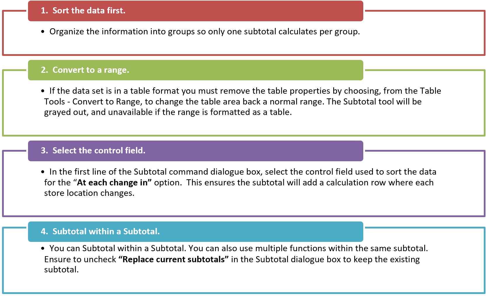
MedAttrib: Beginning to Intermediate Excel. MS Excel Subtotal Rules.
ACTION: Try Me activity
Let’s now work with an Excel file: Ch19–Summary.xlsx. This is a dataset from Taste du Monde of products and their prices. Before starting work, save a copy of Ch19–Summary.xlsx to your Examples folder. Then, open that file for work.
Because there are two tasks on different sheets, the images of our progress will appear through the chapter.
There are 5 worksheets in Ch19–Summary.xlsx. The dataset in the Sales worksheet is a table object for easy sorting. Let’s find out how to create a subtotals table from it. Follow the below steps to Subtotal the sales reps and provide a total current sales per region.
- Double-click the Sales worksheet name tab, and choose to make a copy of the sheet to follow the Sales worksheet. This is so we don’t adjust the Sales worksheet’s main table’s data as we learn.
- Rename the copy of the Sales worksheet as SalesSubtotals.
- Select the SalesSubtotals worksheet and click anywhere in the table area.
- From the Data tab, choose Sort button. Sort the Region by A to Z.
- Select “Convert to Range.” Excel will display a message asking if you really want to convert the table back to a normal range. Choose Yes.
TIP: Converted tables. Converted-to-text table heading rows no longer have filter buttons. The data looks like a table but is not an Excel table object any longer. The table tools are not active, and the information is a normal dataset. Also, any table name you assigned in the Table Design menu’s Table Name field will not translate.
- Next, click the Data ribbon tab, in the Outline group, and find & select the Subtotal icon.
- In the Subtotal dialogue box, choose the Region field in the “At each change in.” For the “Use Function,” choose Sum (which is the default setting), and check Sales from the Add Subtotal to list. Click OK.
- SAVE your work.
- Scroll down the worksheet, and observe that the Sales column is totaled, per region, Like East, Island, etc.
Subtotal Outline View
For the summary table to be at all useful – especially if the table is more than a page or two long, there has to be a way to manage what we are seeing. The summary table Outline views, located on the left side panel, show summary statistics. The Outline tool, with levels, allows you to control the expanse of detail displayed in the worksheet.
Currently, the dataset defaults to showing everything. On the left side of the dataset, look for the minus signs in the lines of the ‘levels.’ These behave as collapsing icons. If you click one, the level it represents will collapse out of sight.
The SalesSubtotals worksheet has three levels in the Outline of its data range:
- Level 1 displays only the grand totals. It is currently uncollapsed.
- Level 2 displays the total spent at each region. It is currently uncollapsed.
- Level 3 displays the total sales. It is currently uncollapsed.
The image below shows the Level 3 Outline, all the sales reps detail per region, which by default is uncollapsed. Clicking the outline buttons located to the left of the row numbers lets you choose how much detail you want to see in the worksheet. (Note that the three level numbers are at the top left side of the worksheet, just below the Name box.)
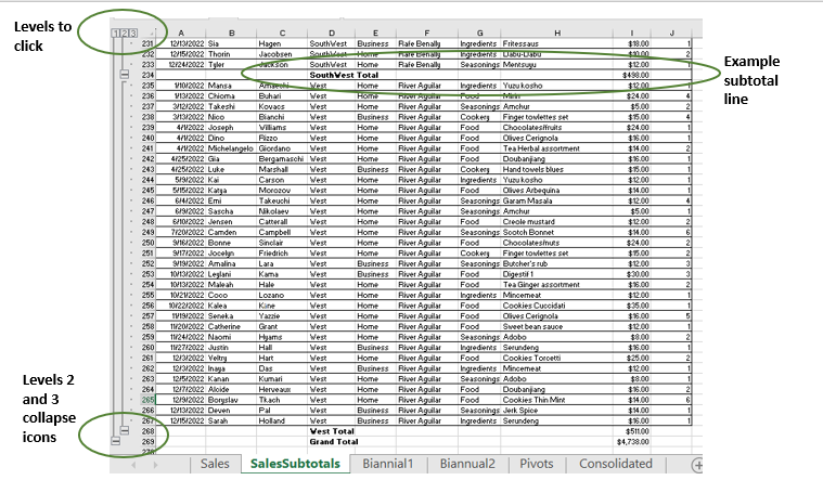
MedAttrib: author-generated. MS Excel subtotals table.
You will use the outline buttons to expand and collapse different sections of the data range.
- Click level 1. Notice it displays the Grand Total.
- Click level 2. Notice the totals for all store locations are displayed.
Consolidated Pivot Tables
Next let’s learn how to consolidate multiple tables of data so they can be viewed (and charts created) from one summary table. We will be doing this with Pivot tables, not the main or the Biannual tables. Why? Because Pivot tables already do that consolidating of Excel basic tables or datasets. This is an additional method which allows you to consolidate multiple pivot tables.
NOTE: The Excel built-in table wizard demonstrated below does not work for MACs. As a result, MAC users would need to combine “separate” original data tables into one longer data table on a new sheet, and create a single pivot table from that single table instead. Extra steps but possible.
FOR PC USERS
- In the Ch19–Summary.xlsx file, click on the worksheet Biannual1 and review it. This sheet contains all the same data as the main Sales worksheet’s basic table, but only for the first half of 2022. The Biannual2 sheet contains data from the second half of the year.
In this activity’s case, for real life there isn’t really enough data to require this kind of table separation, but consider if a lot more data is actually collected quarterly or monthly, then compiled into a full annual table, yet still needs some summarizing by quarter or biannual range. This is what Consolidated Pivot tables can help with. This chapter’s file already has the main table separated into two Biannual worksheets with an appropriate Excel basic table on each, then a Pivots worksheet in which Pivot tables have already been created from those two Biannual Excel basic tables.
In Ch19–Summary.xlsx, go into the Pivots worksheet. The Pivot tables are currently sorted by the segment of the customers who make purchases (Business and Home), the categories of the products they chose (like Cookery), and the regions the different regions had purchases made from. Let’s consolidate this data into a single Consolidated Pivot table for expressing to a pie Pivot chart.
- Go to the Consolidated worksheet. There are prep areas for two different summaries. We will focus on the first – creating a Consolidated Pivot table. Remember, these will be MS Windows for PC steps only.
- Click somewhere around cell A5.
- Press your keyboard’s Alt key and D key at the same time, then release. Then press the P key. A PivotTable and PivotChart Wizard will open the first of 3 steps.
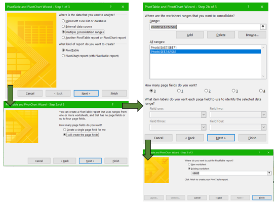
MedAttrib: author-generated. MS Excel consolidating tables Wizard.
- The data we need for a Consolidated Pivot table will come from more than one existing Excel Pivot table, so select the Multiple consolidation ranges.
- Also, choose Table only, then click Next.
- For step 2a, choose “I will create the page fields”, because you will be selecting where the data comes from.
- Click Next.
Step 2b requires us to tell Excel where the data we want to consolidate is coming from. It will be from each of the two Pivot tables in the Pivots worksheet.
- First, while this step is open, enter the Pivots worksheet, then select all of the cells of data in the whole first Pivot table, NOT including any grand total. NO GRAND TOTAL, which if included would completely skew your Consolidated Pivot table’s amounts. Once you select the header row and data rows (minus the grand total row), the data range address will pop into the Wizard’s step 2b Range field.
- Then press the Add button above the range. This will add the range into the window showing the existing range selections.
- Next, while still in this step, select all of the cells in the second Pivot table (minus the grand total row) in the Pivots worksheet. Once you select it, the data range will pop into the Wizard’s 3rd step Range field.
- Then again press the Add button above the range. Now you should see two data ranges in the window.
- Keep the “How many page fields do you want” at the default 0.
You should now see two listed ranges of data.
- Click Next to get step 3, which asks where you want the resulting Consolidated Pivot table. In the Existing worksheet field, type =$A$7. This will place your Consolidated Pivot table in the Consolidated worksheet’s cell A7.
- Click Finish.
- SAVE your work.
PIVOT TABLE CLEANUP – Both PC and Mac
A new pivot table has now opened in your Consolidated sheet starting at cell A7. It doesn’t look very helpful. Let’s tidy it up, first by narrowing it to something we’d like to understand. Let’s say that we’d like to see the sales of only the Business and Home segments, but in percentage (not dollar) format.
- In the Consolidated Pivot table, use the Row Labels filter to unselect everything, then choose only Business and Home.
- In the PivotTable Fields panel, uncheck the Column. This will remove a column from the Consolidated Pivot table.
- In the PivotTable Fields panel, click the arrow in the Sum of Value field. Choose Value Field Settings.
- In the Value Field Settings dialog box, choose the Show Values As tab.
- In that tab, click the dropdown menu, and select % of grand total, then click OK.
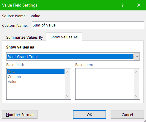
MedAttrib: author-generated. MS Excel Value Field Settings panel.
- In the resulting changed pivot table, select cells B8-B10, and format them with no decimal point.
- In cell A7, overwrite the text with the word Segment.
Now we have a basic Consolidated Pivot table, made from two Pivot tables that came from two biannual Excel basic tables derived from a bigger Excel base table. Oh. . . my . . .
FOR MAC USERS:
because Mac users do not have access to the Wizard used above, they have to consolidate info differently. It is a little more cumbersome, but can yield the same results. However, this isn’t really a great option for massive tables, though PowerQuery and Power Pivot (more advanced) can do a lot more. For now (MACS ONLY):
- You will need to create a new sheet after the two Biannual sheets. Name it AllSales.
- Copy the full table from Biannual 1 and paste it in cell A4.
- In Cell A4, change January-June 2022 Sales to read All 2022 Sales.
- Copy the full table from Biannual2 and paste it into the AllSales sheet in the first A cell just below the end of the Biannual1 table you already pasted in there.
- Go to the Biannual1 sheet, and copy Rows 1-3, then paste them into the AllSales sheet’s Rows 1-3 to make the Taste du Monde/website link consistent on the AllSales sheet.
- At this point, the new AllSales sheet should have the combined data from the Biannual1 and Biannual2 tables copied into it plus the same Rows 1-3 Taste du Monde title/icon/website link.
- NEXT, in the Consolidated worksheet, click in Cell A7, and create a pivot table based on the AllSales sheet’s All 2022 Sales table.
- Finally, scroll up this textbook page to this chapter’s PIVOT TABLE CLEANUP – Both PC and Mac instructions, and follow those to set up your new pivot table.
CHART
How about a slice of pie? Or, more accurately, a Pie Chart?
- Choose a Pie, 3D option and click OK.
- Drag the new Pie chart so that it is to the right of the Consolidated Pivot table.
- Right-click on the Pie chart, and in Add Data Labels, choose Add Data Callouts.
- SAVE your work, and close the file. We’re done!
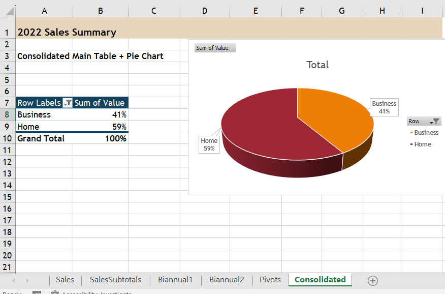
MedAttrib: author-generated. MS Excel consolidated table and chart.
