Chapter 21: Chart/Graph Modifications
What We’ll Cover >>>
- Accessibility
- Filtering Charts/Graphs
- Chart Labels
- X-Axis and Y-Axis Formats
- Chart Area Titles
- Data Series Labels
You can use a variety of formatting techniques to enhance the appearance of a chart/graph once you have created it. Formatting commands are applied to a chart for the same reason they are applied to a worksheet: they make the chart easier to read. However, formatting techniques also help you qualify and explain the data in a chart. For example, you can add footnotes explaining the data source as well as notes that clarify the type of numbers being presented (i.e., if the numbers in a chart are truncated, you can state whether they are in thousands, millions, etc.). These notes are also helpful in answering questions if you are using charts in a live presentation. You can change the arrangement of some row or column references by making them bigger or moving them on the chart. You can clarify axes information beyond the defaults that Excel provides in chart creation.
We’ll look at a few options in this chapter. They can and should become part of your chart creation process.
ACTION: Try Me activity
Let’s now work with an Excel file: Ch21–ChartsDetail.xlsx. This contains two of the charts we worked on in Chapter 20. Before starting work, save a copy of Ch21–ChartsDetail.xlsx to your Examples folder. Then, open that file for work.
We’ll be working with two charts, so the finished images will appear later in this chapter. You can scroll down to see them now, if you wish.
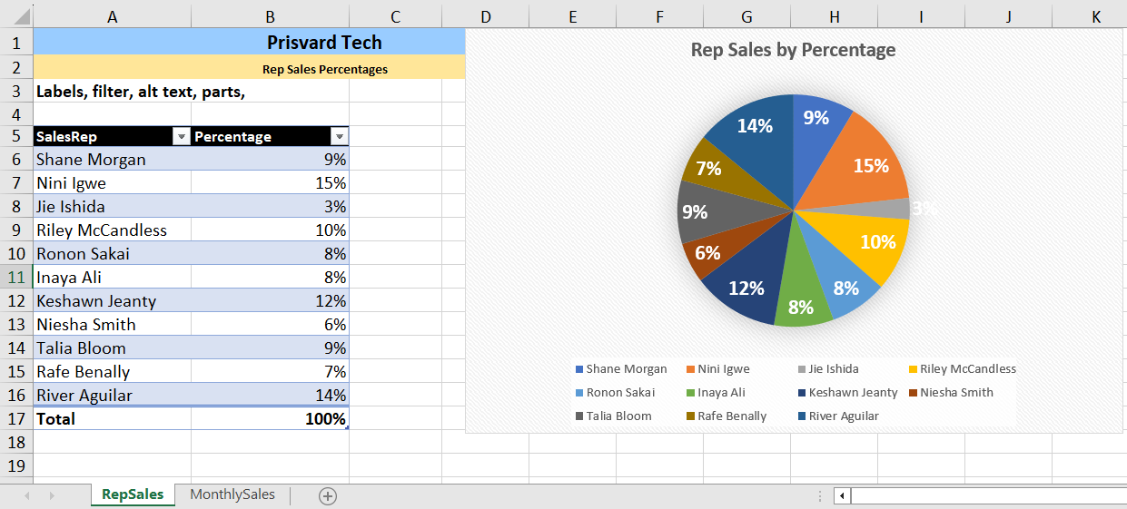
There are 2 worksheets: RepSales for a Pie chart, and MonthlySales for a Column chart.
Accessibility
Charts are graphic items, like photos, shapes, tables, and SmartArt. Whenever you place one in Excel, you should make a point of making sure it meets accessibility standards for when the workbook is distributed. You also might want to add some intellectual property information, so that the Excel metadata for the workbook accounts for the chart creation. More information on how to do this is in the Distribution chapter of this book.
In Ch21–ChartsDetail.xlsx, go to the first worksheet: RepSalesChart.
The chart actually does not have a name. In Excel, all items you create should be given a name, whether a table, a data range you need to calculate with, images, SmartArt, shapes, and charts. This is, for instance, so that data range info is easier to find; so that formulas/functions can use named ranges instead of manual cells selections; and so other users of your Excel workbooks can easily identify important ranges of data.
However, naming a chart is not as self-evident as it is for naming a table. There is no Chart Name field in the contextual Chart Design ribbon tab like there is for naming Excel tables.
- Click on the Pie chart, and go to the Excel Name box at the left end of the Formula Bar. In it, the Pie chart will be named something like Chart1 or Chart37. In the Name box, overwrite the existing name with something that identifies the chart, like PTsaleschart. This helps identify the Pie chart if it is needed in any other Excel reference.
- To help the Pie chart be recognized by a screen reader, click on the chart and go to the Chart Format ribbon’s Accessibility group.
- Click the Alt Text icon. This opens a panel that lets you add alternate text to a chart/graph, so that a screen reader can interpret for a user who cannot see the chart.
- In our case, for practice, simply type: Excel pie chart of 2022 sales by percentage.
All this does is let a screen reader know there is an image and offers a summary of what the image is. However, note that the details of the chart itself, like what the percentages are, who the sales representatives are, and other table-related information isn’t something that can go into alternate text. Any remaining accessibility has to be part of overall Excel workbook creation.
You can also add appropriate attribution information on a chart by giving it a caption with this content as well as a brief description of what the chart is. If you create the chart itself, but from other data, you should also give attribution/citation of the data.
- Click on a cell below the Pie chart – cell D20 – and write a simple caption: Prisvard Tech’s sales representatives’ 2022 sales by percentage.
- SAVE your work.
Filtering Charts/Graphs
Charts and their graphs can be filtered, as needed. This doesn’t pivot the information with the same flexibility as Pivot tables and Pivot charts, but Excel does allow tables and charts to accept and refresh to show changes in the table filters.
- In the RepSalesChart worksheet, click on the table to activate it.
- In cell A5, use the filter button to deselect all, then select only Inaya, Nini, and River.
- SAVE your work.
The Excel table will show only the percentages of those three sales reps, and the Pi chart will refresh to do the same.
- In cell A5, use the filter button to clear the filter.
Chart Labels
Review the Pie chart. Notice how small the labels are. They are white on the color backgrounds, but they are so small they may fade into the overall chart and not provide much information.
Click on the Pie chart, and look at the top right side of its border. There are 3 icons that, when clicked, open a variation of the various options you can access from icons on the Chart Design and Format ribbons.
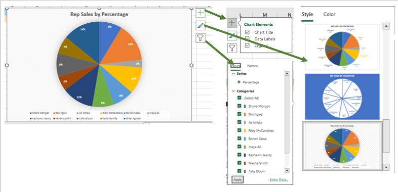
MedAttrib: author-generated. MS Excel Chart options.
- Click on the chart, and go to the Chart Format ribbon, Chart Layouts group.
- Click the Add Chart Element, then choose Data Labels, and More Options.
Excel will open a Format Data Labels panel to the right of the workspace. In it, you can work with the Label Options (types of labels) and Text options (granular detail of how the labels are formatted). Note that dealing with labels, legends, and other individual chart elements is not for the faint of heart or something that can be done fast and easily. It takes patience, and may require touching each element separately. Still, let’s see what we can do.
NOTE: As you later click on different areas of your chart (title, legend, an axis) the Format panel will change the panel’s format area name depending on what chart area you clicked, like to Format Axis, Format Data Series, Format Title, etc.
- For instance, in the Format Data Labels panel, select Label Options, and in the dropdown, select Series “Percentage” Data Labels.
This selects all of the tiny percentage numbers in the pie chart at one time.
- Then, with those selected, click in the Panel’s Text options. There is nothing that lets you change all the labels’ text size. Let’s try some other method.
- With those text boxes still selected, go to the Home tab Font group, and change the font size to 18. Yay! That lets you change the font size all at once, (unlike back in the author’s salad days, decades ago. . .) which is pretty cool.
- Click the chart somewhere away from the data labels, and the panel at the right will rename itself Format Chart Area. This allows you to format various things using this same panel.
- Click the Chart Options, and select Legend / More Options This selects the visual representation of the chart’s data series (in this case, the sales reps) shown at the bottom of the chart. These are tiny, too.
- With this Legend area text selected, go to the Home tab Font group, and change the font size to 12. That let you change the font size for the legend all at once. This increases the space needed and decreases the pie chart’s graphic a little, but overall, the chart is more readable.
- SAVE your work.
TIP: Formatting Axes shortcut step. You can actually double-click on a horizontal category X axis, a vertical (value) Y axis, a chart’s title box, and a chart’s legend, to open the needed item’s Format Chart panel options instead of using those 3 icons at the side of the chart.
MedAttrib: author-generated. MS Excel pie chart modifications.
X-Axis and Y-Axis Formats
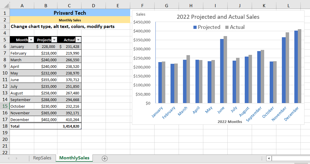
Let’s work with the other chart, Go to the second worksheet: MonthlySales. It shows a stacked Column chart with an X and Y axis.
Review
Let’s start by changing the chart type, since the provided Stacked Column chart in the MonthlySales worksheet doesn’t really give the kind of comparison that is easy to discern. A Clustered Column chart might work better.
- Click the chart, go to the Chart Design ribbon, and choose the Change Chart Type icon. Choose a Clustered Column, the version in the left-side preview, and click OK.
- Next, use the Change Colors icon to change the colors to Colorful Palette 2.
- In the Chart Format ribbon, set the chart width to 7.5 inches and the height to 5 inches.
- In the Chart Format ribbon, click the Alt Text icon.
- In the Alt Text panel, type Prisvard Tech projected and annual sales chart, then close the Alt Text panel.
- Click the Column chart, and look at its name in the Name Box to the left of the formula bar.
- In the name box, overwrite the content with PTactsaleschart and press Enter.
- SAVE your work.
Chart Axes
There are numerous formatting commands we can apply to the X-axis and Y-axis of a chart like the column, bar, line, or other axis-based charts. Although adjusting the font size, style, and color are common, many more options are available through the Format Axis pane that can help make the information more readable and useful for interpretation and analysis. Try the below steps to make some changes to the percentage numbers on the vertical (value) Y-axis.
- In the MonthlySales worksheet, click on the 2022 Projected and Actual Sales chart. Click once on the vertical (value) Y-axis – the values are the numbers of the projected and actual sales.
- Go to the Home tab Font group, and change the font size to 14.
- Click once on the horizontal category X-axis to select the month labels – which is the category for this axis.
- Go to the Home tab Font group, and change the font size to 12.
- Double-click on the same horizontal category X-axis, which will open a Format Axis panel.
The Format Axis panel offers Axis options for placement, showing faint tick marks, and several other micromanaging choices.
- In the Axis Options, choose Labels, and in Distance from Axis, change 100 to 20.
- In the Text options, choose the Text Fill & Outline icon, and under Solid Fill, change the color to a dark blue.
- Close the Format Axis panel.
- SAVE your work.
Chart Area Titles
Titles for the X and Y axes are necessary for defining the numbers and categories presented on a chart. For example, by looking at the 2022 Projected and Actual Saleschart, it is not clear what the percentages along the Y-axis represent. The following steps explain how to add titles to the X and Y axes to define these numbers and categories:
- Click anywhere on the 2022 Projected and Actual Sales chart to activate it.
- In the upper right corner of the graph, choose the Charts Element plus sign. Select Axis Titles in the dropdown, then checkmark Primary Horizontal and Primary Vertical. This inserts the place holders that you can type text in.
- Mac Users: click the “Add Chart Element” button in the Design tab, point to “Axis Titles” and click on “Primary Horizontal.” Do this one more time and click on “Primary Vertical”.
One problem is that these Axis titles seem to run into things. The Y-axis and its title run together, and the X-axis title runs into the Legend. Ugh.
- Click on the chart, and choose the Charts Element plus sign again.
- Choose Legend, and then Top. This gets the Legend out of the way of the X-Axis title.
- Carefully click on the vertical (value) Y-axis title. Drag it to the top of the chart.
- Double-click the Y-axis title to open the Format Axis Title panel.
- In the panel, choose Title options, then the Size & Properties icon.
- Below that icon, click Alignment, and in the dropdown, choose Text Direction.
- In Text direction, choose Horizontal.
- Close the Format Axis Title panel.
- Click the Y-Axis title, and on the Home tab Font group change the font size to 14.
- Then type Sales in this -axis label.
- Now, let’s do the other axis title. Click the horizontal category X-axis title, and on the Home tab Font group change the font size to 14.
- Then, type 2022 Months in this X-Axis title.
- Now, let’s make the Legend more readable. Click the Legend, and on the Home tab Font group change the font size to 18.
- Now, let’s make the Title pop more. Click the Title, and on the Home tab Font group change the font size to 20.
- SAVE your work.
Data Series Labels
Adding labels to the data series of a chart is a key formatting feature. A data series is an item that is being displayed graphically on a chart. For example, the blue bars on the 2022 Projected and Actual Sales chart represent one data series. We can add labels at the end of each bar to show the exact percentage the bar represents.
- Be sure that the entire chart is selected, not just one of the data series. Then click the Chart Design ribbon.
- On the Design tab select the Add Chart Element button, then Data Labels, then Outside End. Click on one of the Data Labels. Note that now all of the data labels for that data series should be selected.
- Now, given how dense this particular chart is, these data labels do not help – they make it almost unreadable.
- On the Design tab select the Add Chart Element button, then Data Labels, then None. This removes them.
- SAVE your work, and close the file. We’re finished!
MedAttrib: author-generated. MS Excel column chart modifications.
